go;go is a concept fashion and wellness brand. Its visual identity is refined yet playful; high-end yet accessible. It combines clean lines, gradients, and simple shapes, with imperfect design: textured type, asymmetrical layout, elements askew. It has a focus on form and quality.
The shape of the logo speaks all for itself.

go;go's primary logo is clean, subtle, modern, and refined. go;go is for the modern young woman on the go: high-quality stretch walking pants, travel-sized makeup and skincare, day-to-night booties.
PRIMARY LOGO
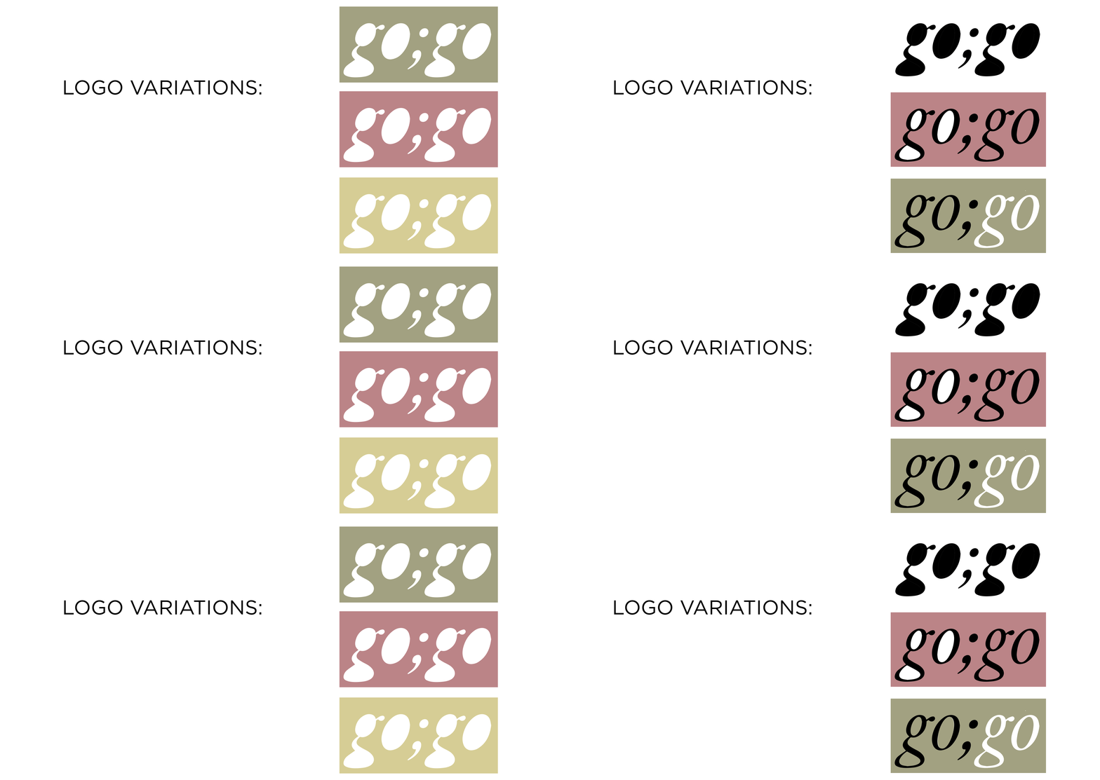
LOGO VARIATIONS

go;go's logo variations speak to the playfulness of the brand. They focus on the organic forms of the letters and their counters, as well as the brand's distinct color palette. The loose and versatile usage of the colors in the shapes and within the counters demonstrates the brand's funky, anything-goes rhetoric. These can be used in any application of the logo.

COLOR PALETTE
go;go's color palette is minimalistic, polished, and unstuffy, and appeals to young professional women aged 18-38.

go;go's primary typeface is Replay Pro Italic. It is elegant and classic, speaking to the high-quality nature of the brand.

go;go's secondary typeface is Idlewild Light. It is clean, light, and a bit whimsical, appealing to a young adult demographic. It supplements Replay Pro to show that go;go doesn't take itself too seriously.
SECONDARY TYPEFACE
PRIMARY TYPEFACE
ICONOGRAPHY AND GRAPHICS

The iconography set consists of simple shapes as well as forms pulled from the logo. They utilize the brand's color palette to show personality, add decoration, simplify communication, and reinforce brand identity.
go;go's usage of gradients further serve the brand's modern, fresh feel. They add a sense of ethereality, fluidity, and dimensionality.
INSTAGRAM FEED


The Instagram feed includes graphics, reviews, and product and lifestyle photography. The color scheme of the feed is designed around the color palette of the brand, using relevant imagery and bold text to highlight products and sales.


